| |
| |
| |
| |
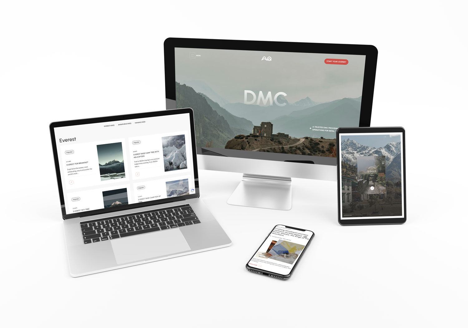
Welcome to The CnC Edit, showcasing the work we do to help brands scale their digital presence. Today’s feature focuses on Adventure Quest, a legacy travel company celebrating nearly three decades in business. Read on for a breakdown of our approach to their rebranding & repositioning. | |
| |
| |
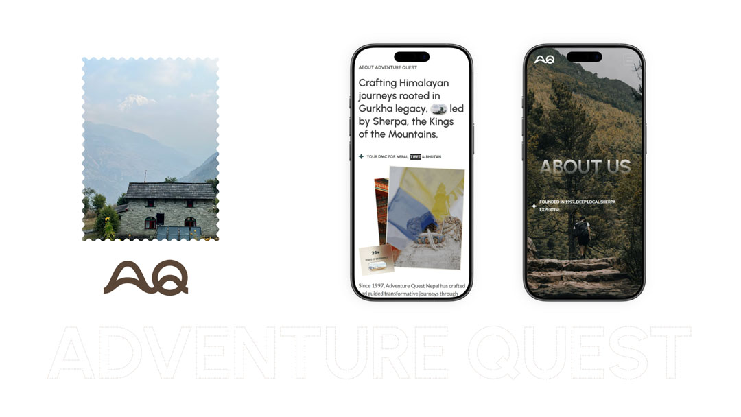
Instead of starting from scratch, we chose to honor Adventure Quest’s deep-rooted legacy. By weaving together the resilience of Gurkha values and the unmatched mastery of Sherpa expertise, we refined their story. | |
Brand Narrative
Built around decades of Sherpa legacy, honor, and unmatched mountain guidance. | |
Color Palette
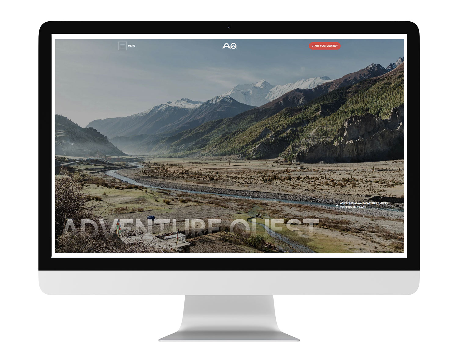
Clean black-and-white palette to let the destination imagery to remain the focal point. | |
Full-Screen Style
Navigation slides out into a clean, full-screen menu for a more immersive browsing experience. | |
| |
| |
Logo & Visuals
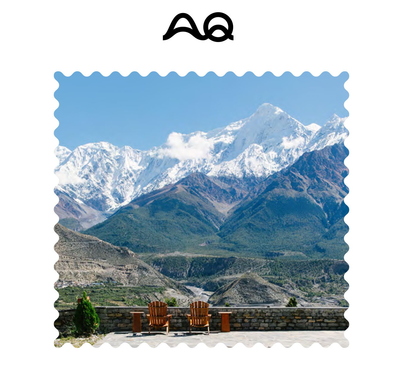
Customized "AQ" monogram merged with organic mountain contours to signal high-altitude expertise immediately. | |
UI/UX Design
A minimalist, clutter-free navigation bar that lets high-impact photography take center stage. | |
Section Breaks
Divider lines with waypoint markers strengthen the narrative flow, making each section feel like a new stage of the journey. | |
| |
| |
This collaboration with Adventure Quest reinforced our core beliefs:
| |
Legacy Drives DesignBuild on existing heritage to create a stronger, more relevant identity.
| |
Less Creates More Minimal design keeps the focus on the story and experience.
| |
Design With Purpose Every visual choice should reflect the brand’s DNA.
| |
Experience Over Function A website should guide users through a journey, not just provide information.
| |
| |
We’ll be back soon with a closer look at another project. The CnC Edit Team | |
| |
| |
Want to chat? Our team is just a message away.
| |
| |
| |
| |