Aviskara | Bridge between Nepal and the world
|
Our Expertise
Technology
-
Website Design and Development
Fully custom designed website
specifically curated for your
business. -
Web app development
Secure, reliable web portals that attract and engage customers -
Mobile app development
To keep up with on-the-go, mobilecentric consumers
-
Progressive web app development
Cost-effective web-based mobile application solutions that can operate in offline environments -
UI/UX design for website, web application & mobile apps
Curating seamless, intuitive experiences for application users -
Software development
Conceptualizing and creating innovative solutions that cater to your business
-
API development
Tools that help you connect and communicate across systems and other applications -
Comprehensive support & maintenance
Ongoing support from our full team of tech wizards for you websites -
Server hosting & support
Server setup, Monitoring and maintenance - one less thing for you to worry about
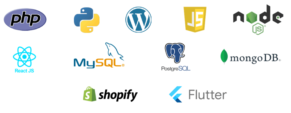
Technologies we use for development:


Art & Design
-
Logo
-
Graphics
-
Art
-
Sketch
Communication & Marketing
-
Content Development
(content writing, photography and videography)
-
SEO
-
Graphics
-
Social Media
-
E-newsletter
-
Workshop
(Branding & Strategic Communication)


